Avoid deciding on the table
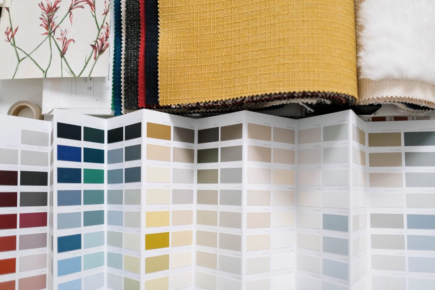
A colour sample lying on a table receives different light from an upright curtain or wall. Place it in the eventual orientation wherever possible. A cushion sample belongs against the sofa; a curtain sample belongs at the window. This brings the neighbouring materials into the comparison instead of treating the colour as an isolated choice.
Use a reasonably large sample when the eventual surface will be large. A tiny piece indicates a shade but says little about its presence in the room. Avoid laying out ten similar alternatives simultaneously. Begin with a few candidates and remove those rejected. Otherwise the neighbouring samples influence the decision more than the furnishings the fabric is meant to accompany.
Choosing together
When several people choose together, view samples in the same place at the same time where possible. Otherwise one person may be describing a sunny morning and another an artificially lit evening. Record which situation matters to each. A fabric need not look identical under every light, but the most frequent use deserves consideration.
Leave the preferred candidate alone in its intended position for a day. Without competing samples, its relationship to existing furniture becomes clearer. If it appeals only beside a less suitable alternative, the decision may need further testing.
Observe the day changing
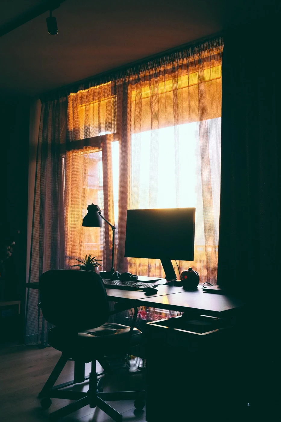
View the sample in the morning, during your normal time in the room and in the evening. Note whether the light is direct sun, an overcast sky or artificial illumination. The aim is not to make a colour remain completely unchanged. What matters is whether you like its changes during the situations in which the room is actually used.
A sample beside the window can differ from the same one on the opposite side. Move it through the area the finished object will occupy. A large rug may receive light from two windows across different sections. Judging it only in the brightest corner does not establish the eventual overall effect.
Compare with materials that will stay
Place the sample beside the wood, flooring and existing textiles that will remain. Pay particular attention to near-matches. Two whites can look more different together than they do separately. A deliberately different tone can be easier to combine than an attempt to reproduce an old fabric exactly.
Photographs help document locations and alternatives, but they are not reliable proof of colour. Automatic exposure and display settings change the impression. Label the back of each sample with the product name and colour reference. Once the decision is made, compare the ordering details again. A similarly named shade in another product is not a guaranteed equivalent, however convincing its screen image appears.